I recently found an interesting R package that animates ggplot2 plots, namely gganimate. This notebook shows some functionalities of it, solely for learning purposes. As a test data set I use gapminder like in the examples of the gganimate package. Nevertheless, I am interested, whether it would support in me in these areas_
- Data analysis, i.e., does it help to generate insights more efficiently?
- Data visualization, i.e., does it help to better communicate findings?
This notebook is organized as follows: Setup, first I show necessary software and settings as well as give an data overview. In Non-animated plots I show some plots that I would create in order to assess the data without any animation for a later comparison. In section Animated plots I try gganimate to create animated plots. I conclude in the last section Conclusion.
Contact: gresch
Setup
Software
- Install R
- Install RStudio
- Install ImageMagick
- Install gganimate via
devtools::install_github("dgrtwo/gganimate")
Libraries
library(gganimate)       # animation package
library(ggplot2)         # plotting package
library(gapminder)       # package with data to visualize
library(dplyr)           # package for data transformation
Settings
theme_set(theme_bw()) # set theme to black and whiteData overview
The data is an excerpt of the Gapminder data on life expectancy, GDP per capita, and population by country. It includes 1704 observations with six variables:
- country
- continent
- year
- lifeExp
- pop
- gdpPerCap
knitr::kable(summary(gapminder))| country | continent | year | lifeExp | pop | gdpPercap | |
|---|---|---|---|---|---|---|
| Afghanistan: 12 | Africa :624 | Min. :1952 | Min. :23.60 | Min. :6.001e+04 | Min. : 241.2 | |
| Albania : 12 | Americas:300 | 1st Qu.:1966 | 1st Qu.:48.20 | 1st Qu.:2.794e+06 | 1st Qu.: 1202.1 | |
| Algeria : 12 | Asia :396 | Median :1980 | Median :60.71 | Median :7.024e+06 | Median : 3531.8 | |
| Angola : 12 | Europe :360 | Mean :1980 | Mean :59.47 | Mean :2.960e+07 | Mean : 7215.3 | |
| Argentina : 12 | Oceania : 24 | 3rd Qu.:1993 | 3rd Qu.:70.85 | 3rd Qu.:1.959e+07 | 3rd Qu.: 9325.5 | |
| Australia : 12 | NA | Max. :2007 | Max. :82.60 | Max. :1.319e+09 | Max. :113523.1 | |
| (Other) :1632 | NA | NA | NA | NA | NA |
knitr::kable(head(gapminder, 15))| country | continent | year | lifeExp | pop | gdpPercap |
|---|---|---|---|---|---|
| Afghanistan | Asia | 1952 | 28.801 | 8425333 | 779.4453 |
| Afghanistan | Asia | 1957 | 30.332 | 9240934 | 820.8530 |
| Afghanistan | Asia | 1962 | 31.997 | 10267083 | 853.1007 |
| Afghanistan | Asia | 1967 | 34.020 | 11537966 | 836.1971 |
| Afghanistan | Asia | 1972 | 36.088 | 13079460 | 739.9811 |
| Afghanistan | Asia | 1977 | 38.438 | 14880372 | 786.1134 |
| Afghanistan | Asia | 1982 | 39.854 | 12881816 | 978.0114 |
| Afghanistan | Asia | 1987 | 40.822 | 13867957 | 852.3959 |
| Afghanistan | Asia | 1992 | 41.674 | 16317921 | 649.3414 |
| Afghanistan | Asia | 1997 | 41.763 | 22227415 | 635.3414 |
| Afghanistan | Asia | 2002 | 42.129 | 25268405 | 726.7341 |
| Afghanistan | Asia | 2007 | 43.828 | 31889923 | 974.5803 |
| Albania | Europe | 1952 | 55.230 | 1282697 | 1601.0561 |
| Albania | Europe | 1957 | 59.280 | 1476505 | 1942.2842 |
| Albania | Europe | 1962 | 64.820 | 1728137 | 2312.8890 |
Non-animated plots
Before testing gganimate I will create some plots via ggplot. For this analysis I will concentrate on the relationship between GDP per capita and life expectancy at birth. To increase readability, I log10ed the x-axis and used color to differentiate between observations coming from different continents. It shows a somewhat positive relationship between these two variables.
ggplot(gapminder) +
  geom_point(aes(gdpPercap, lifeExp, color = continent)) +
  scale_x_log10()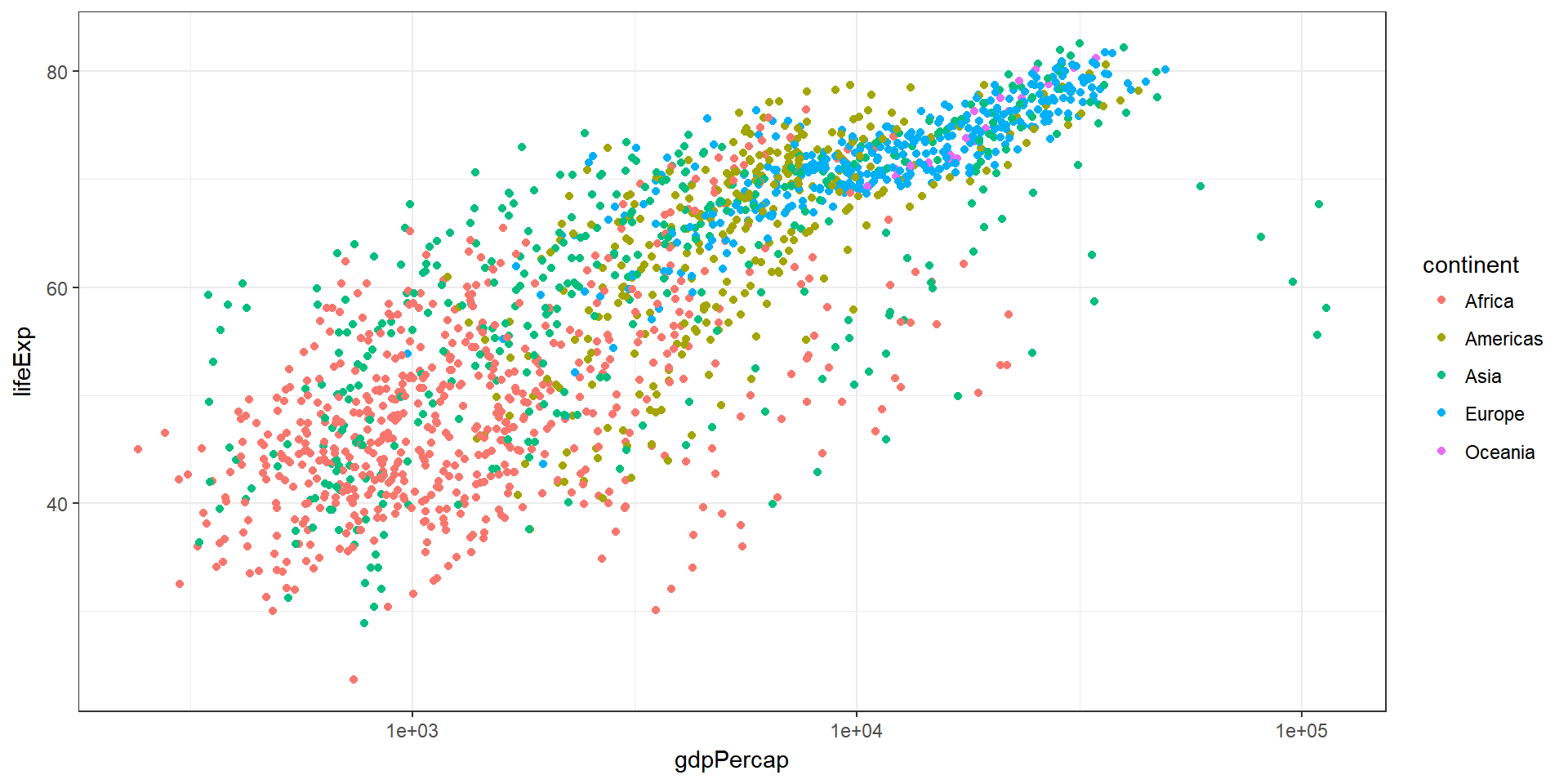
What are possible ways to look at the development of these variables over time (e.g., years)? Here are some means:
- Scatter plot: use of
facet_grid(~year) - Area: Show averages and use
facet_grid(~year)
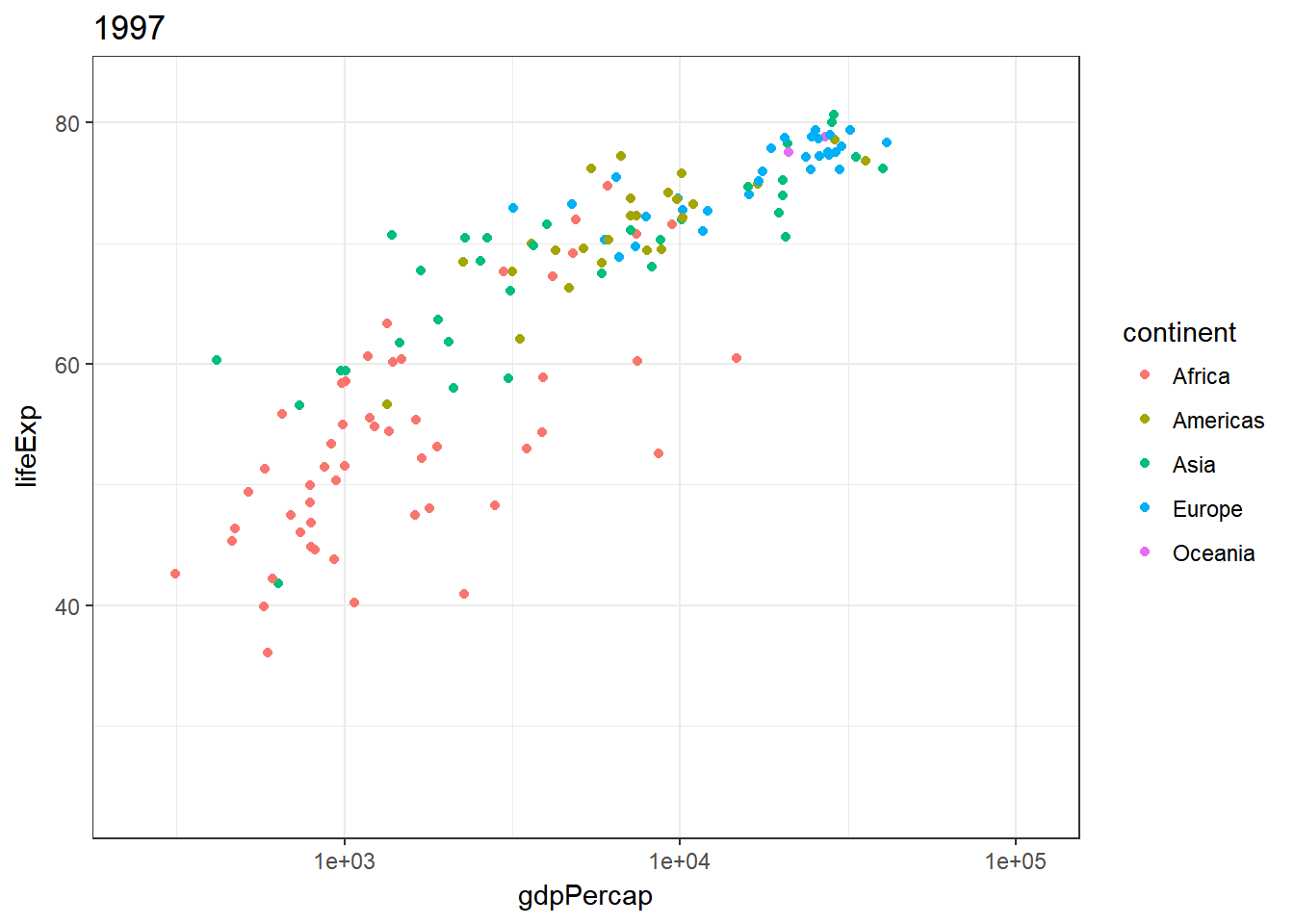
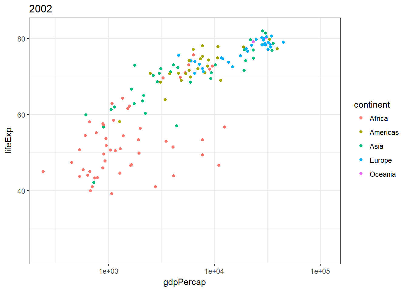
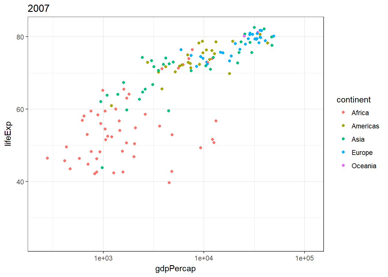
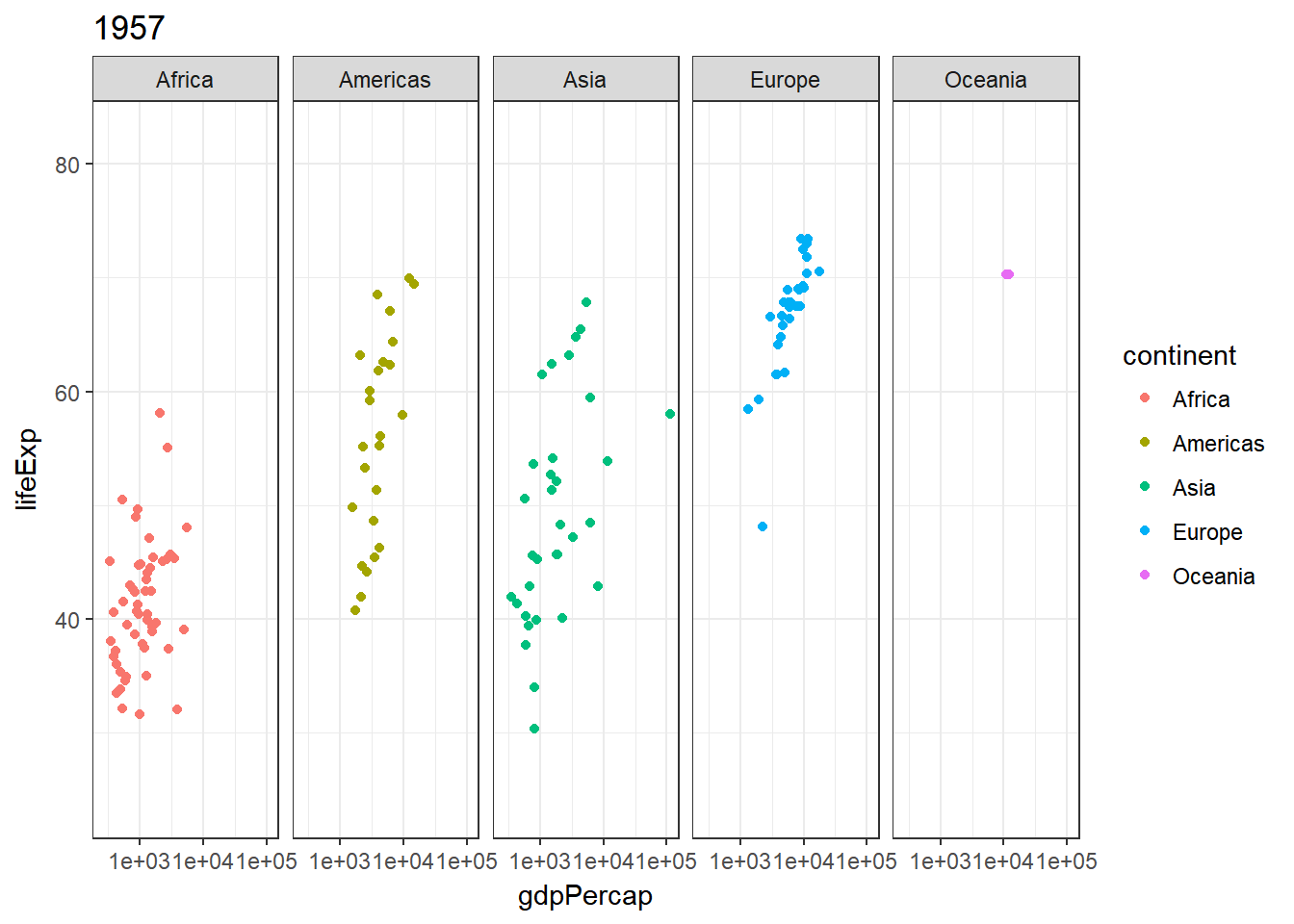
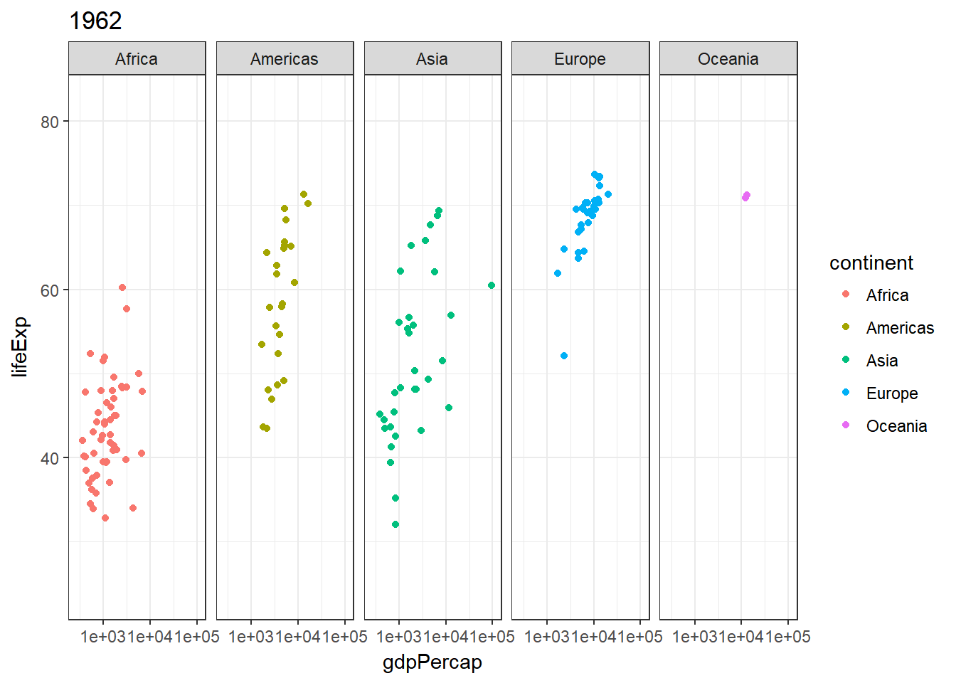
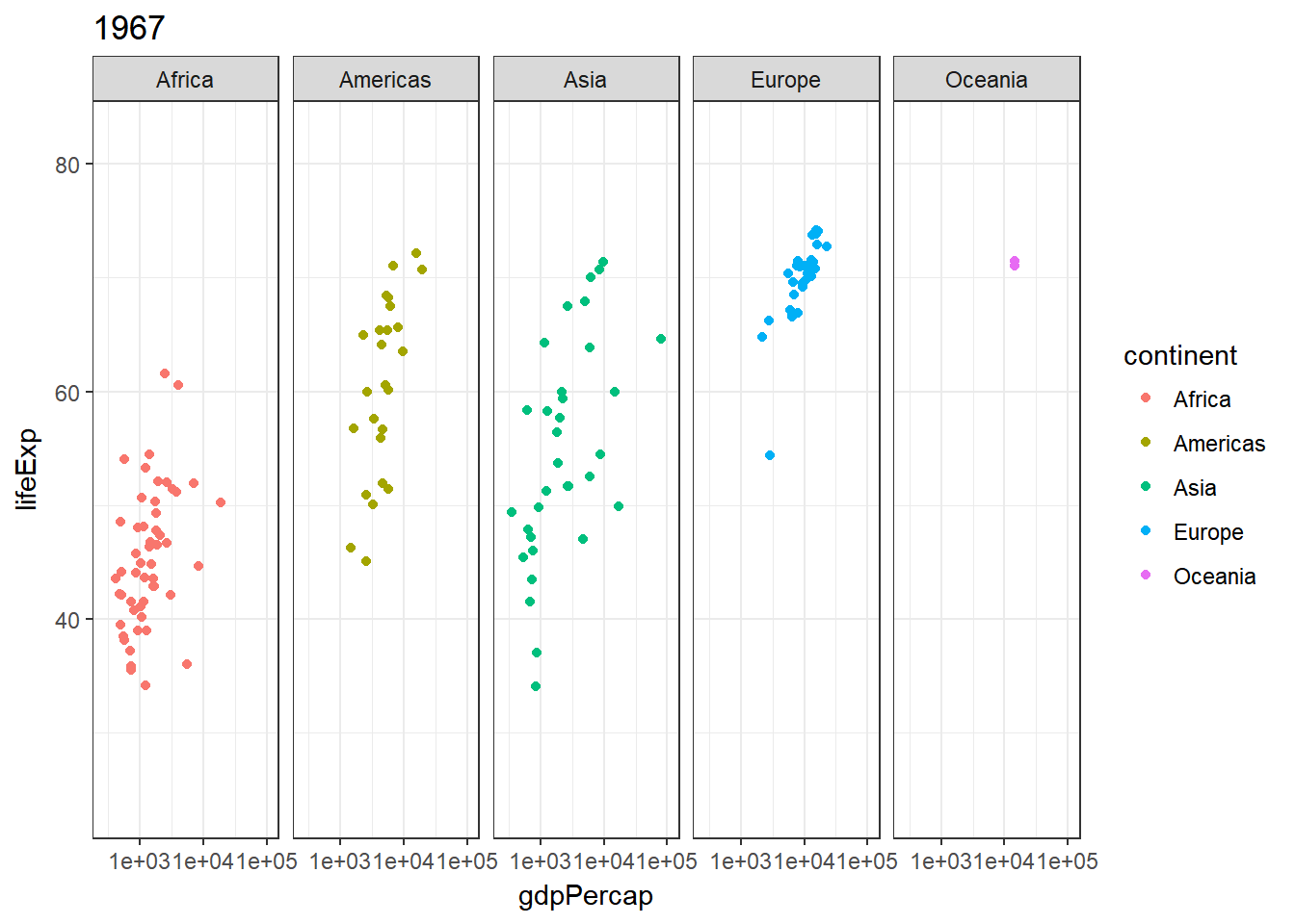
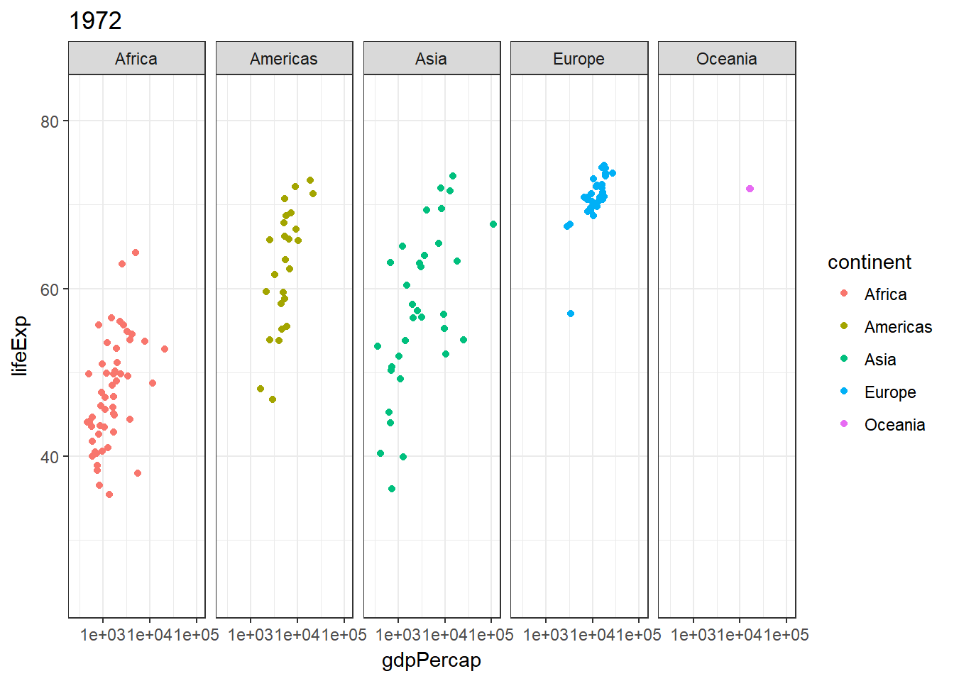
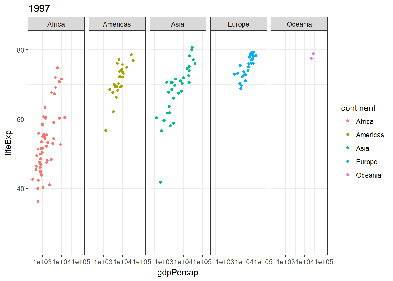
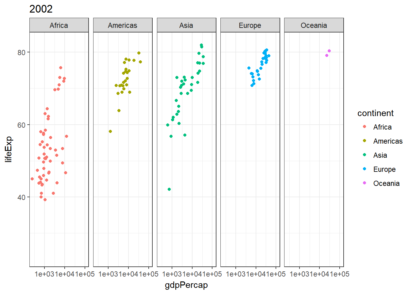
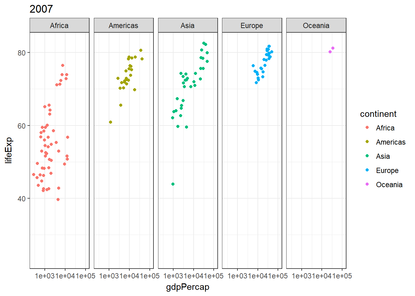
Scatterplot: use of facet_grid(~year)
It overall shows a positive development of life expectancy and GDP per capita over the years, with Europe leading and Africa tailing.
ggplot(gapminder) +
  geom_point(aes(gdpPercap, lifeExp, color = continent)) +
  scale_x_log10() +
  facet_grid(~year)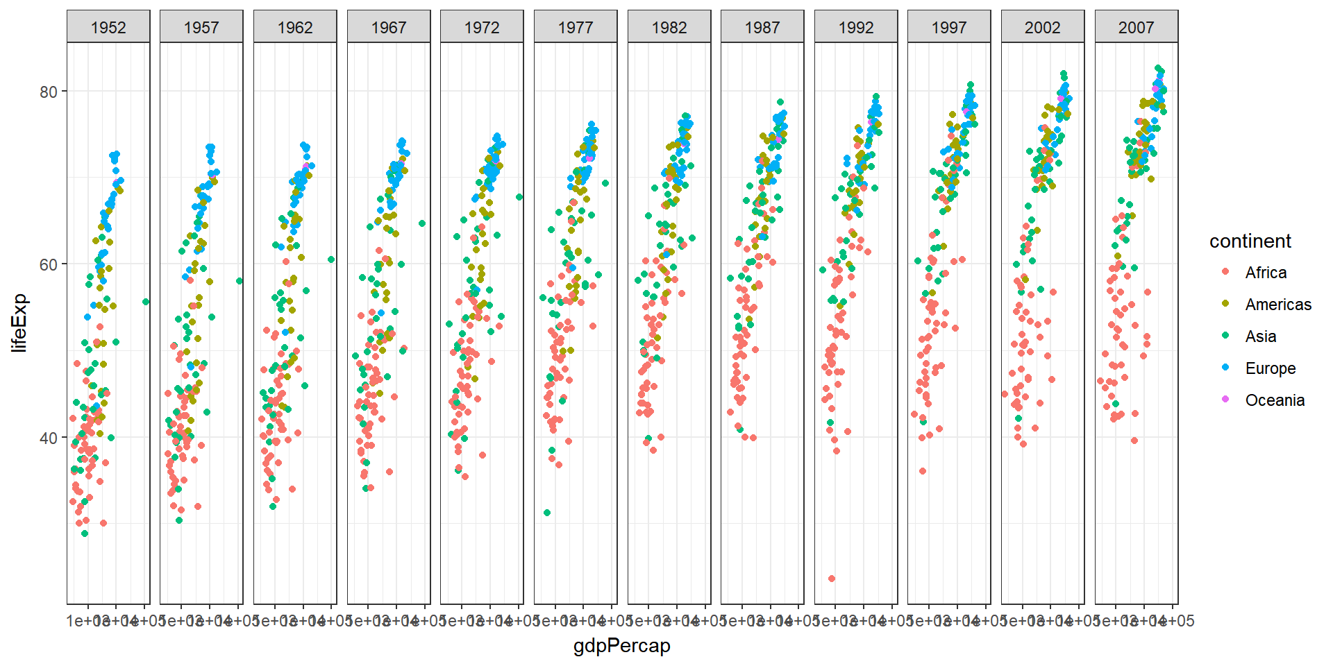
Area: Show averages and use facet_grid(~year)
This plot also shows a positive development of life expectancy and GDP per capita over the years, without showing differentiation for continents.
gapminder %>%
  group_by(continent, year) %>%
  summarise(meanLifeExp = round(mean(lifeExp), 0),
            meanGdpPercap = round(mean(gdpPercap), 0)) %>%
  ggplot() +
  geom_area(aes(meanGdpPercap, meanLifeExp), stat = "identity") +
  scale_x_log10() +
  facet_grid(~year)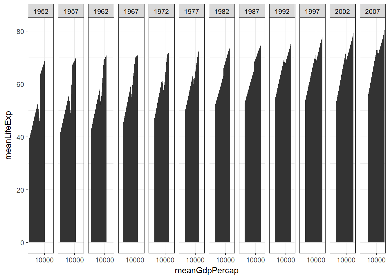
Animated plots
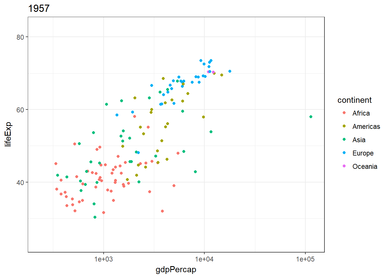
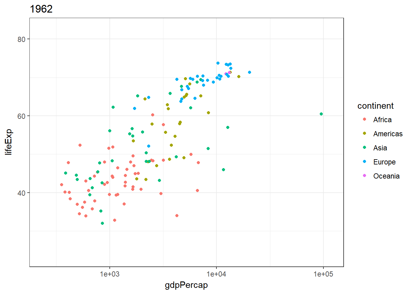
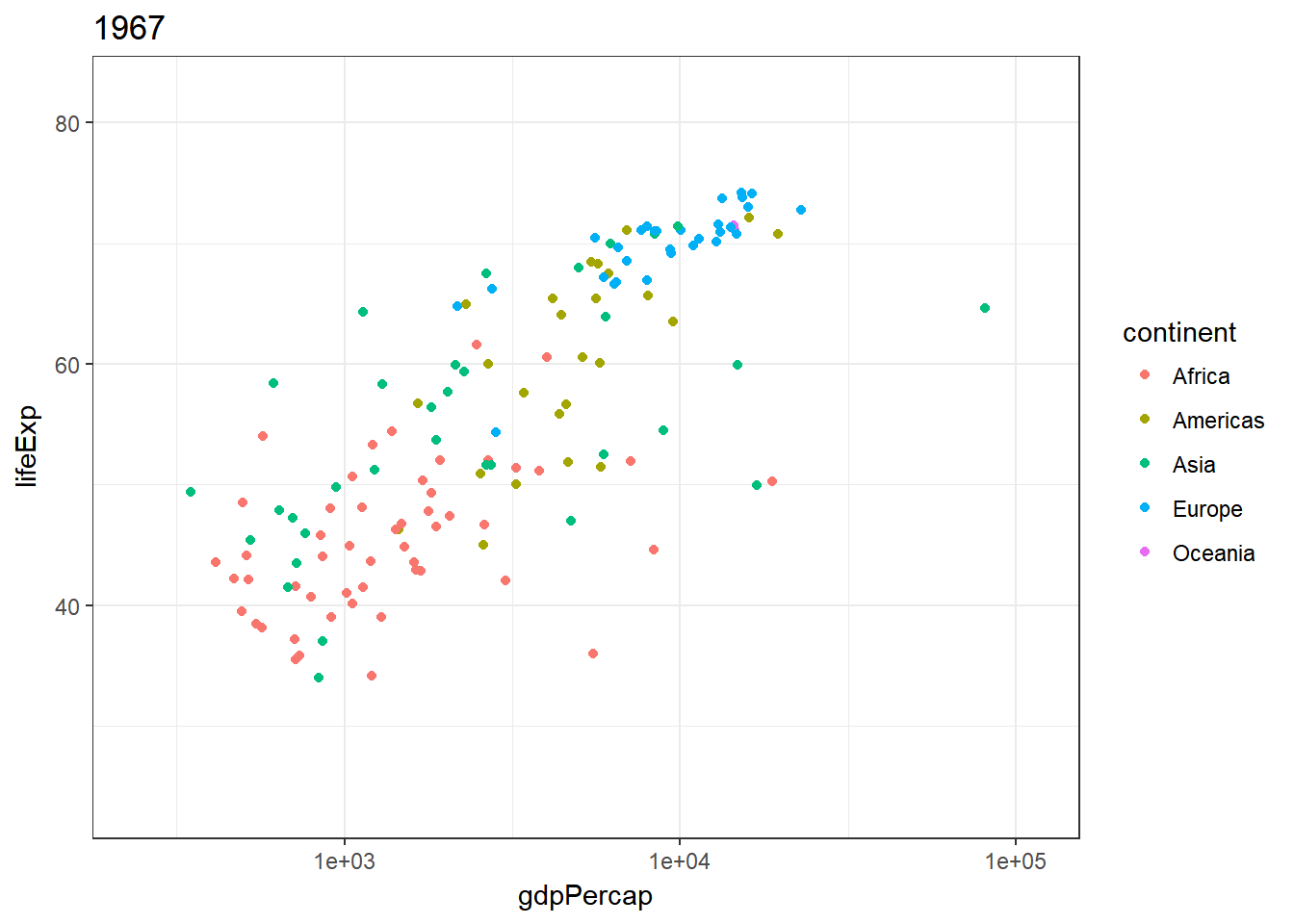
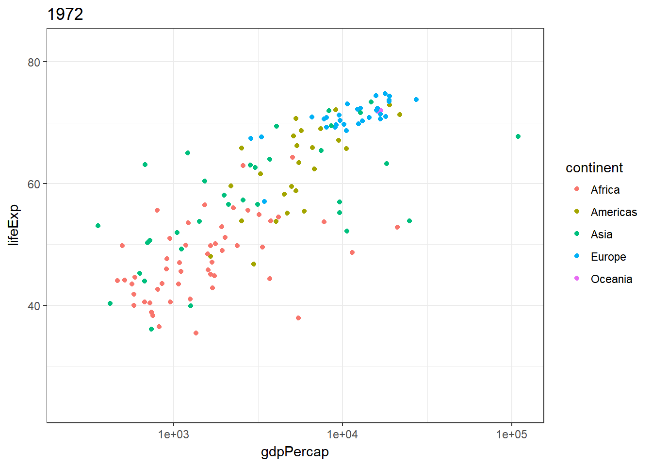
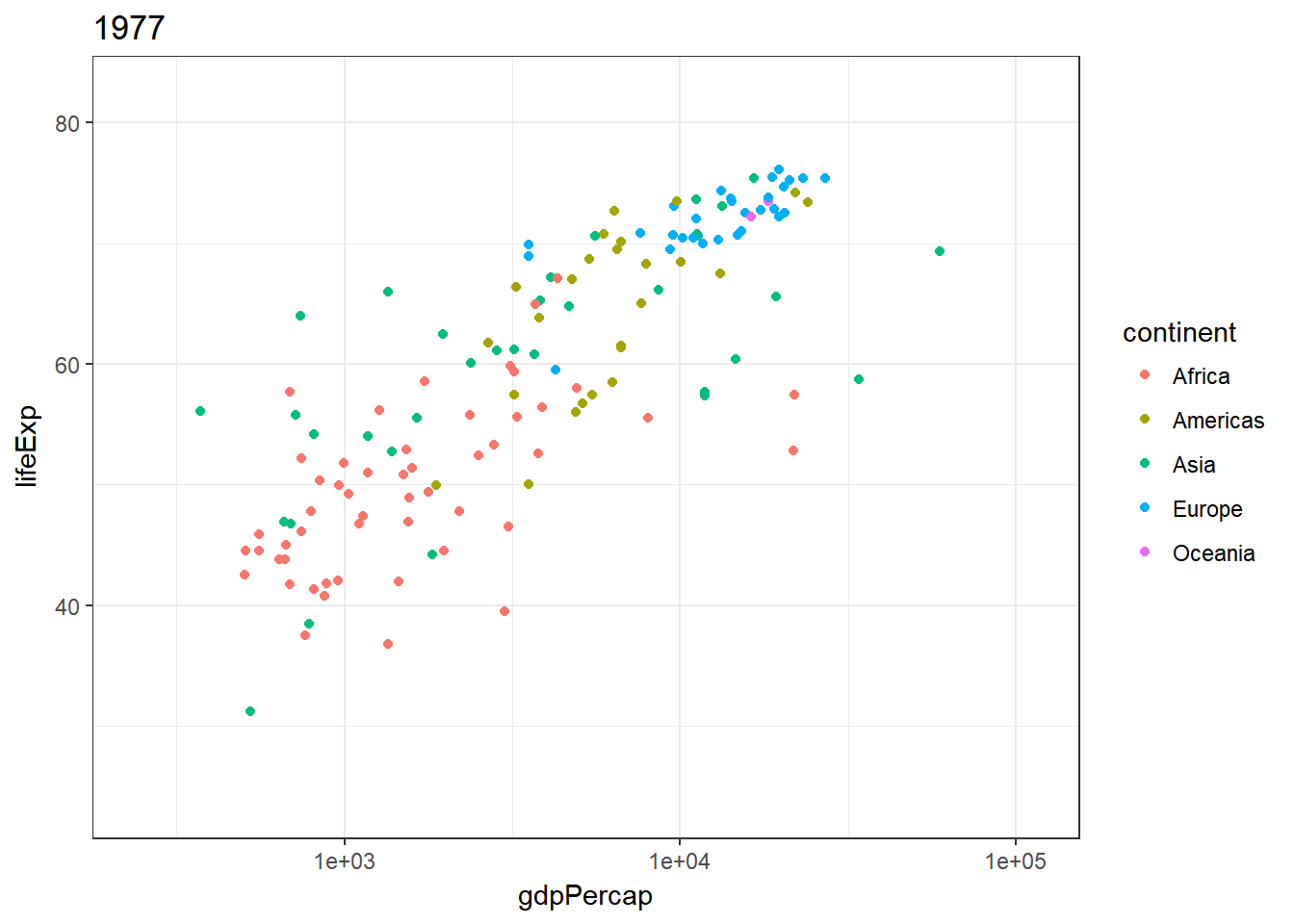
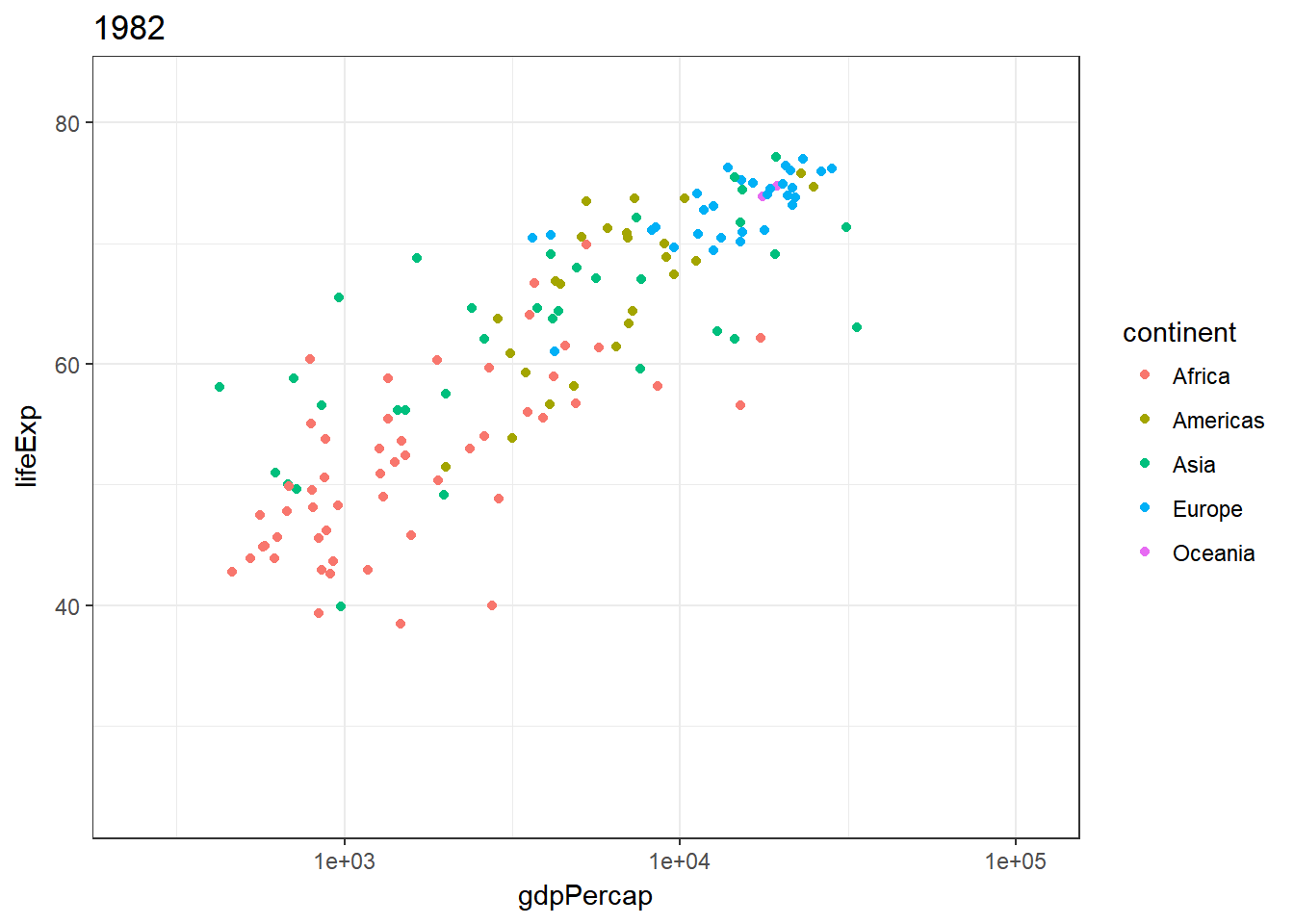
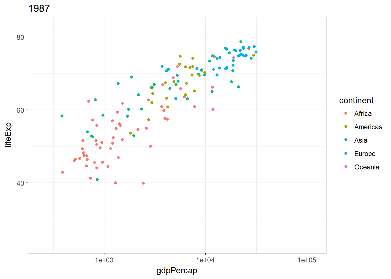
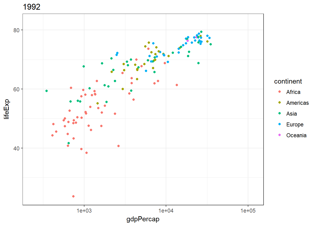
The package gganimate gives me another possibility: to have initial plot for every year provided and to display them in a series. In this case the variable year needs to be set as the frame.
Animated scatterplot
The animated scatter plot shows me the initial plot (i.e., two variables on the axes and the one variable as color fill). In addition, each frame shows a specific year. Frames change every second. Hence, it is possible to view developments over time.
> gg_animate(ggplot(gapminder) +
+             geom_point(aes(gdpPercap, lifeExp, color = continent, frame = year)) +
+             scale_x_log10())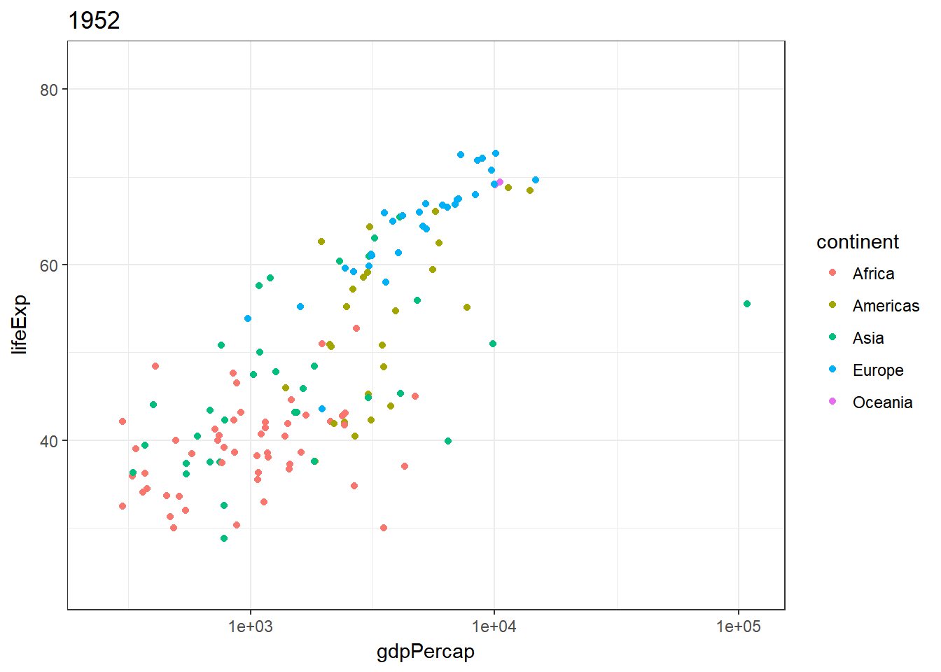
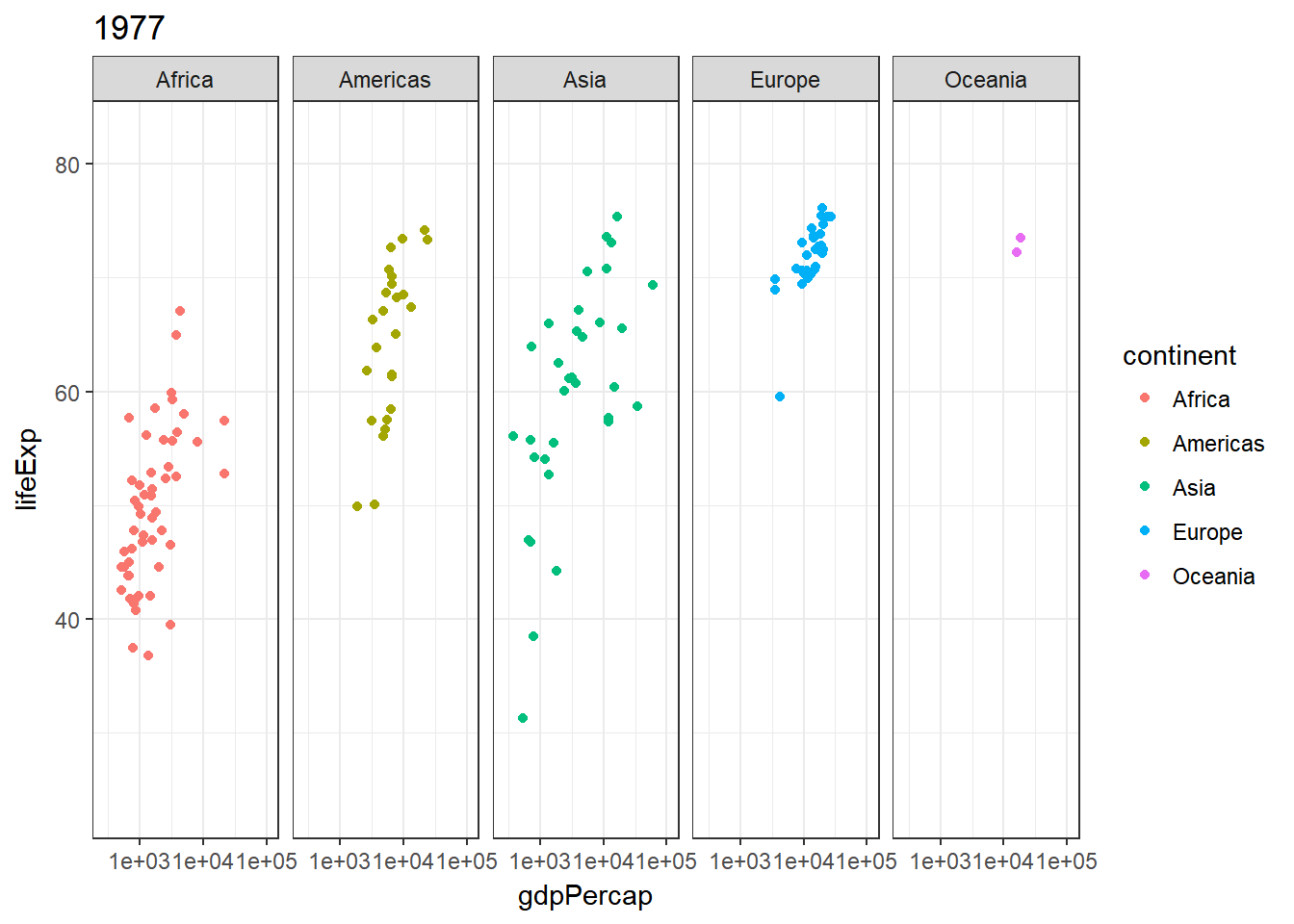
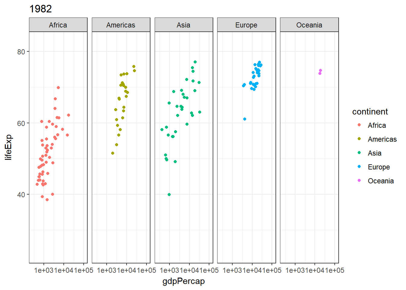
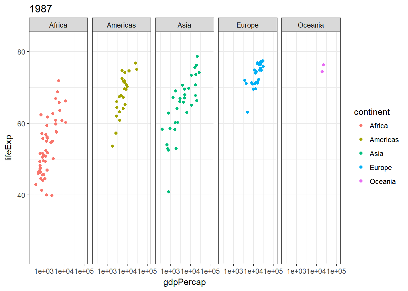
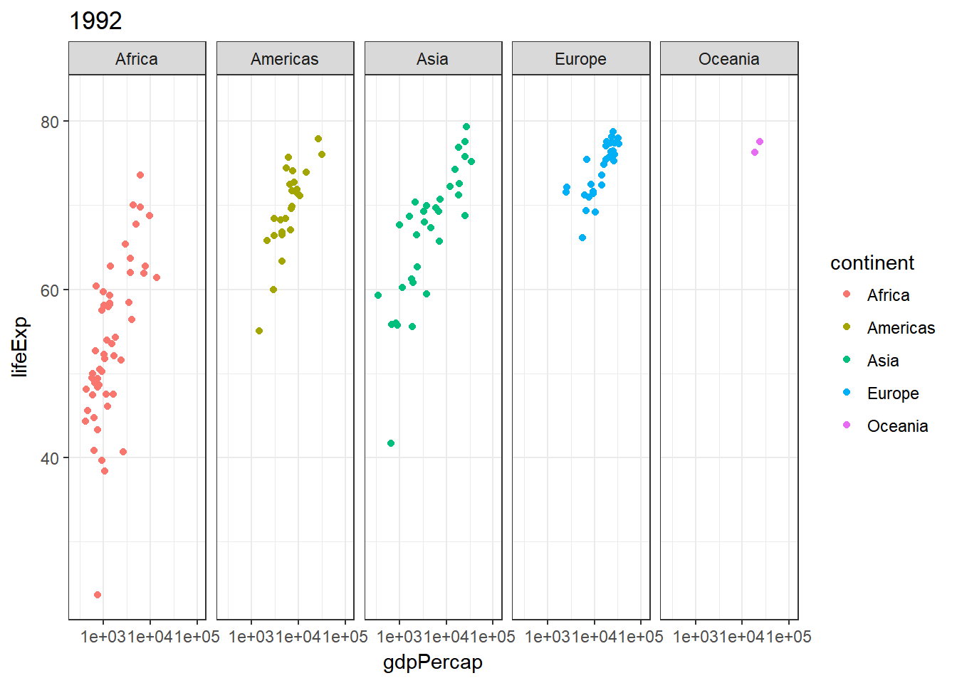
A facet_grid(~continent) further allows now a differentiation on the individual continent developments.
> gg_animate(ggplot(gapminder) +
+             geom_point(aes(gdpPercap, lifeExp, color = continent, frame = year)) +
+             scale_x_log10() +
+ facet_grid(~continent)) 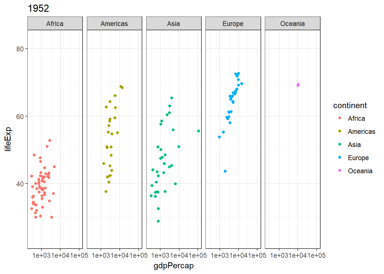
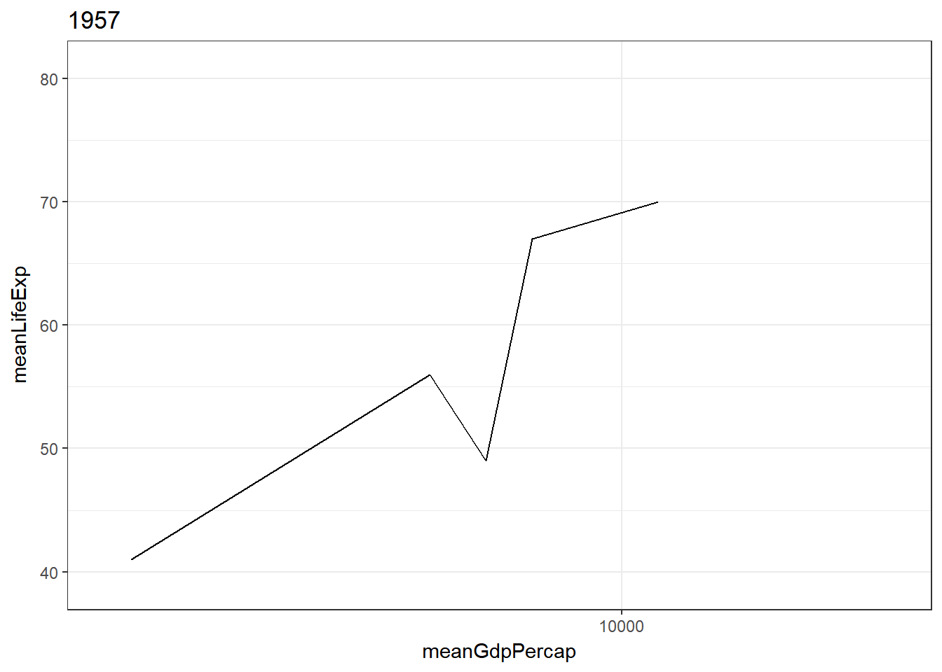
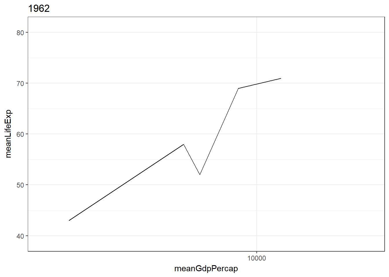
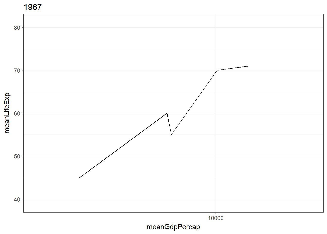
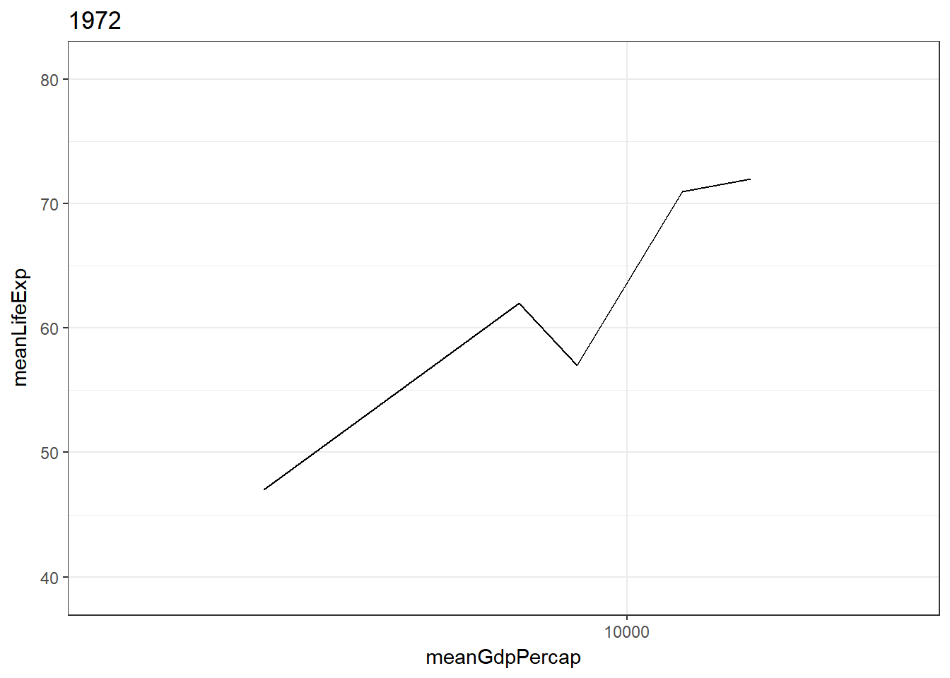
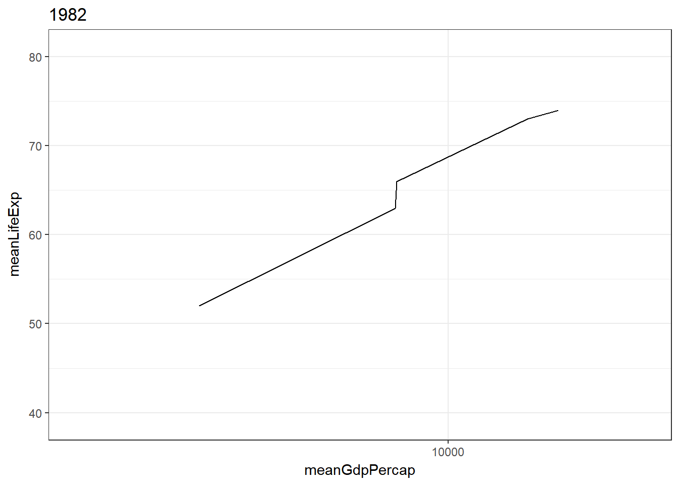
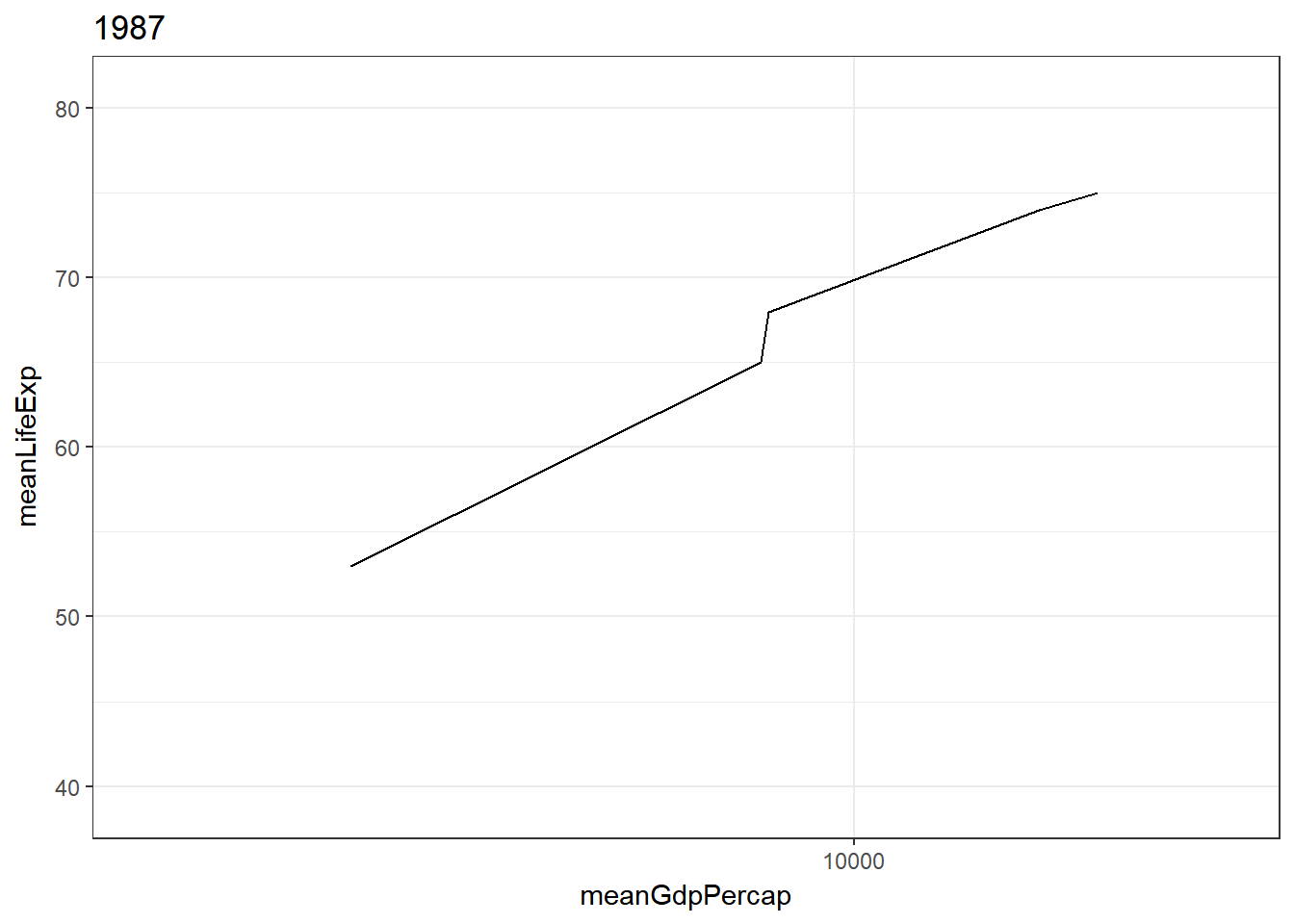
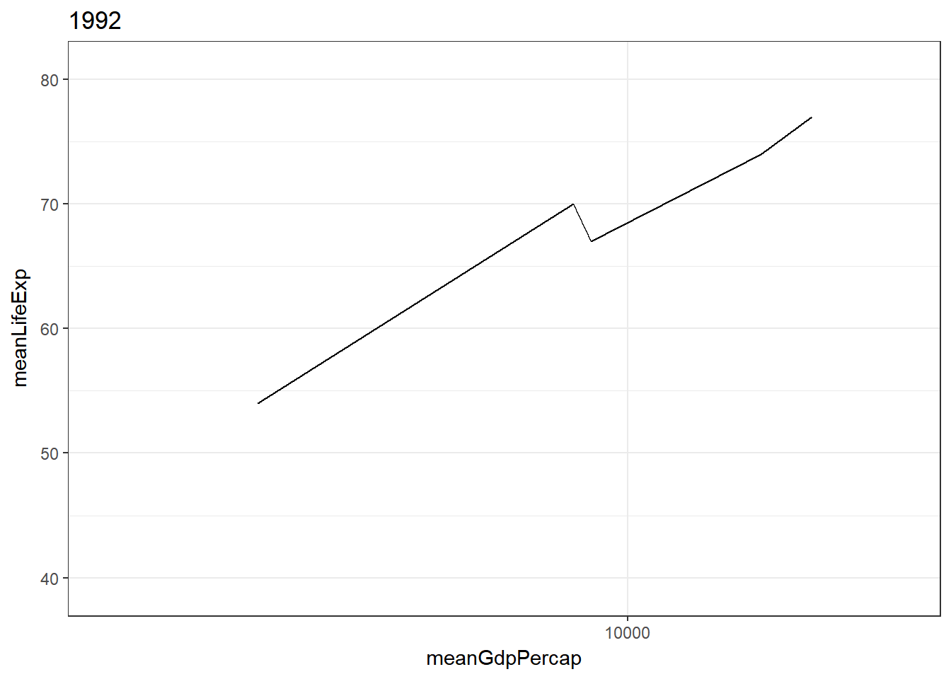
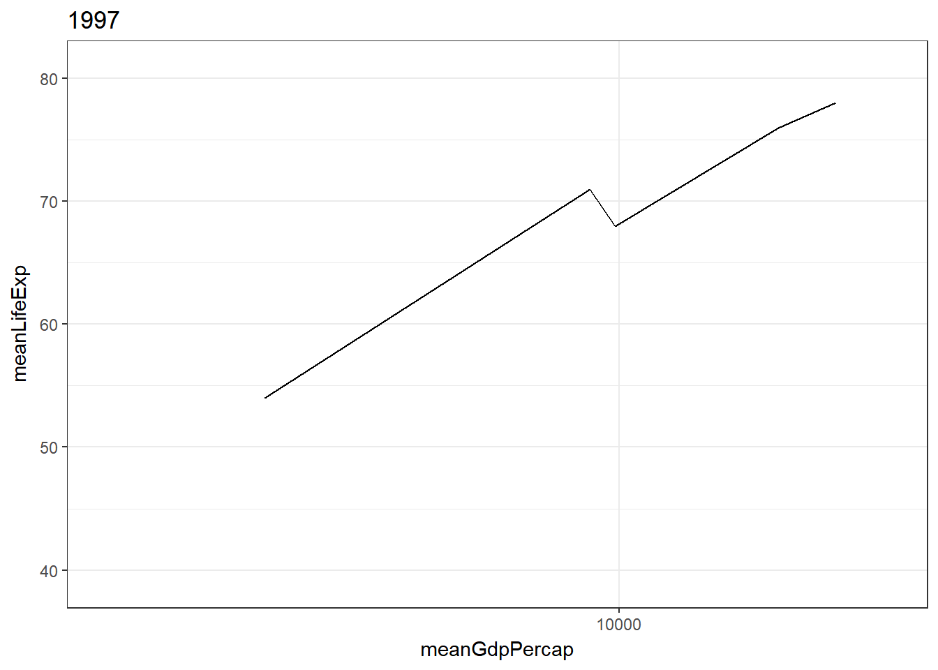
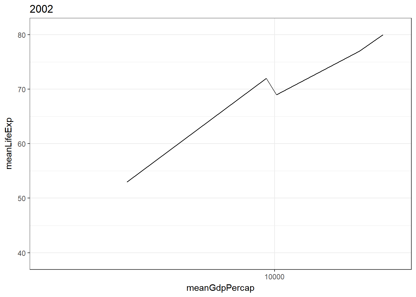
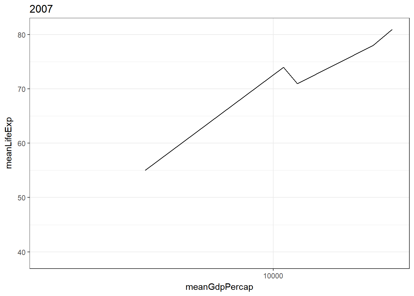
Line chart
> gg_animate(gapminder %>%
+   group_by(continent, year) %>%
+   summarise(meanLifeExp = round(mean(lifeExp), 0),
+             meanGdpPercap = round(mean(gdpPercap), 0)) %>%
+   ggplot() +
+   geom_line(aes(meanGdpPercap, meanLifeExp, frame = year), stat = "identity") +
+ scale_x_log10()) 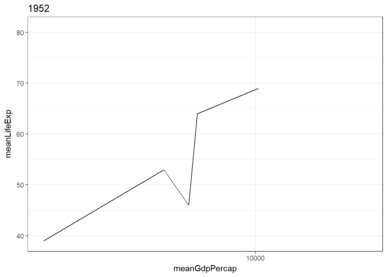

Conclusion
gganimate is an interesting package with some advantages. I will try to use it more often from now on. One open question would be whether it is possible to change width and height of the animated plots.
1. Data analysis, i.e., does it help to generate insights more efficiently?
In terms of data analysis it brings only few benefits. Other plots and means of exploration are available to understand the data, such as histograms, table view, or facet grids.
2. Data visualiazation, i.e., does it help to better communicate findings?
In terms of data visualization I believe gganimate is helpful. The frame provides another dimension to a plot without the need to use color, sizes, or other means that might clutter the plot. Another advantage is that I can tell a story and its development over time (or other variable). Lastly, I think adding animation to visualization is much more compelling and people might engange much more with the plot.